_
EN
Rosamund is a video content production agency for brands and companies, based in Nantes and Paris since 2012. Working with many French groups on a wide range of corporate film formats and recently developing a film and fiction division, the agency decided to accompany its name change - from Linkit to Rosamund - with a complete redesign of its graphic identity with Brand Brothers.
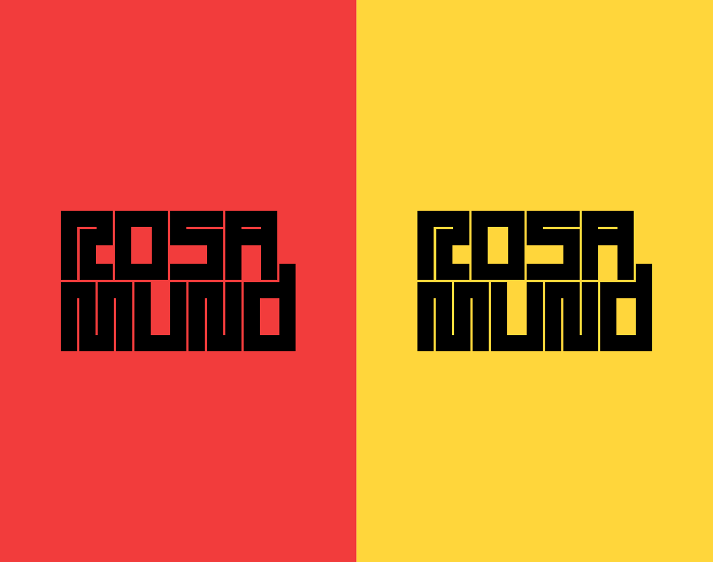
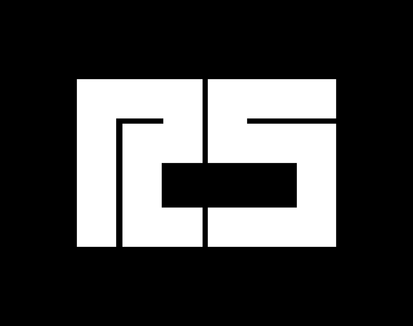
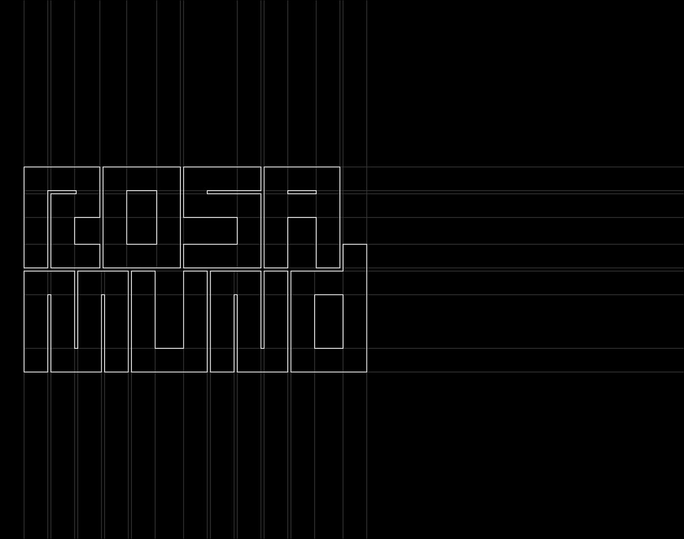
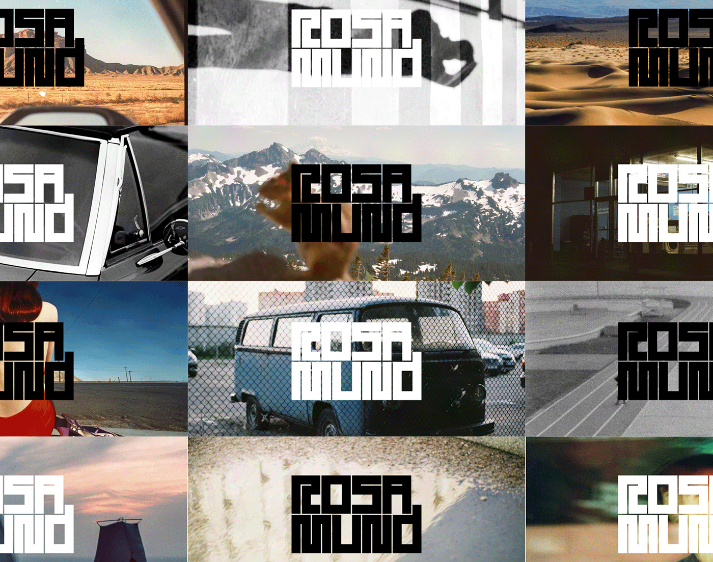
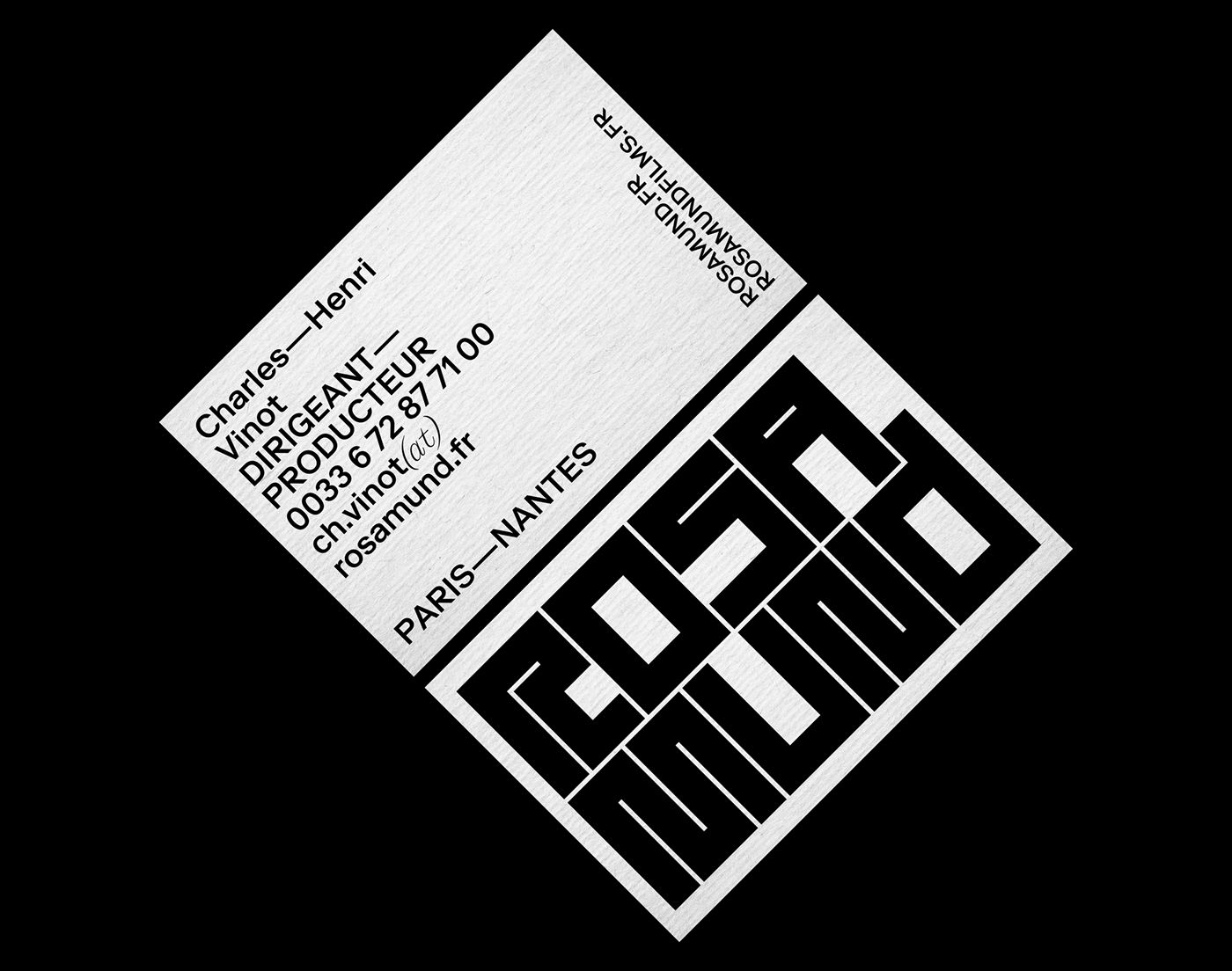
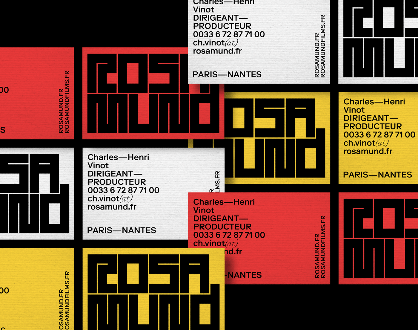
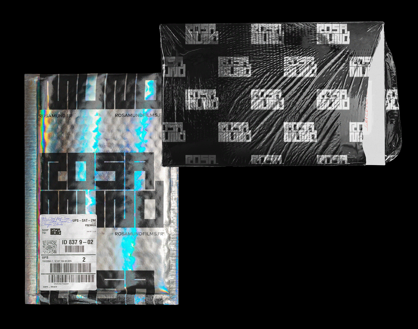
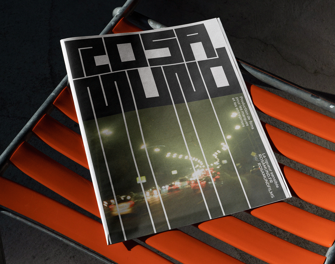
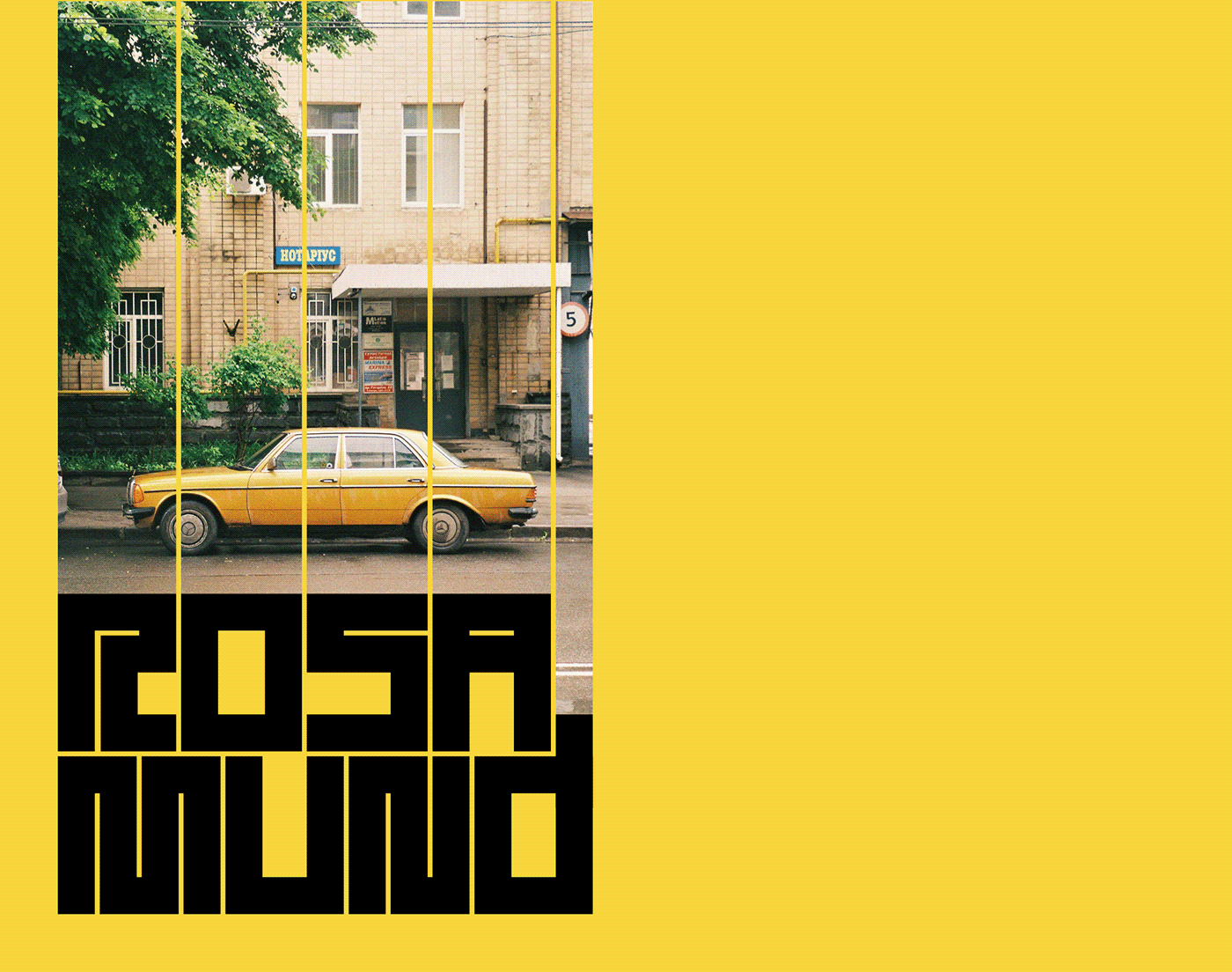
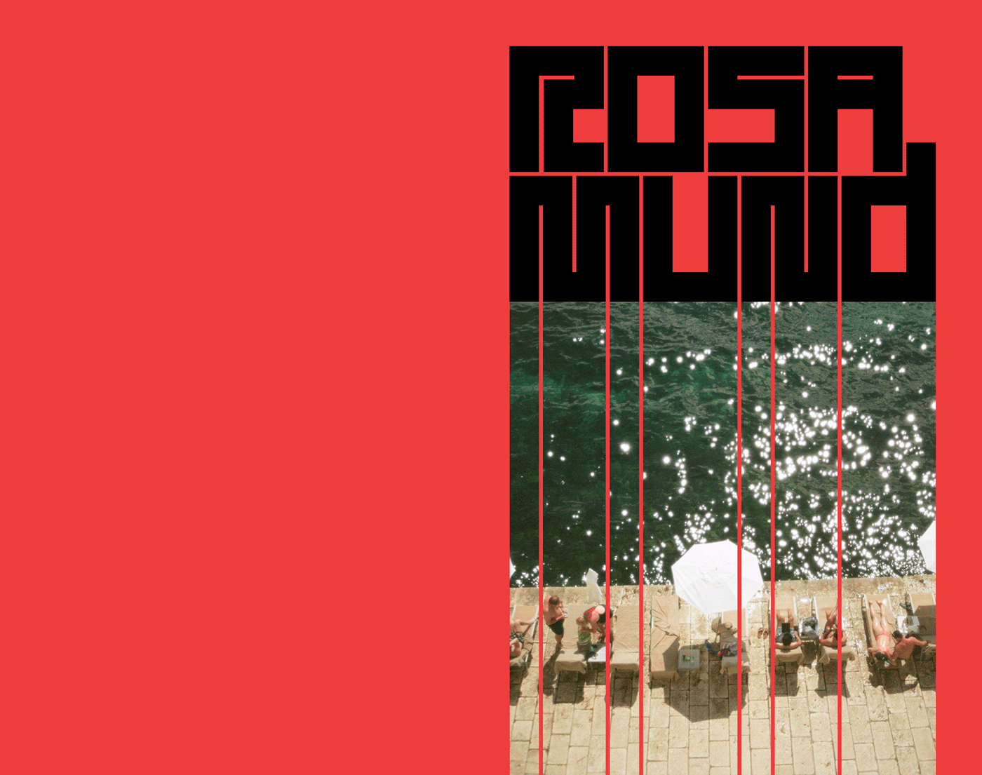
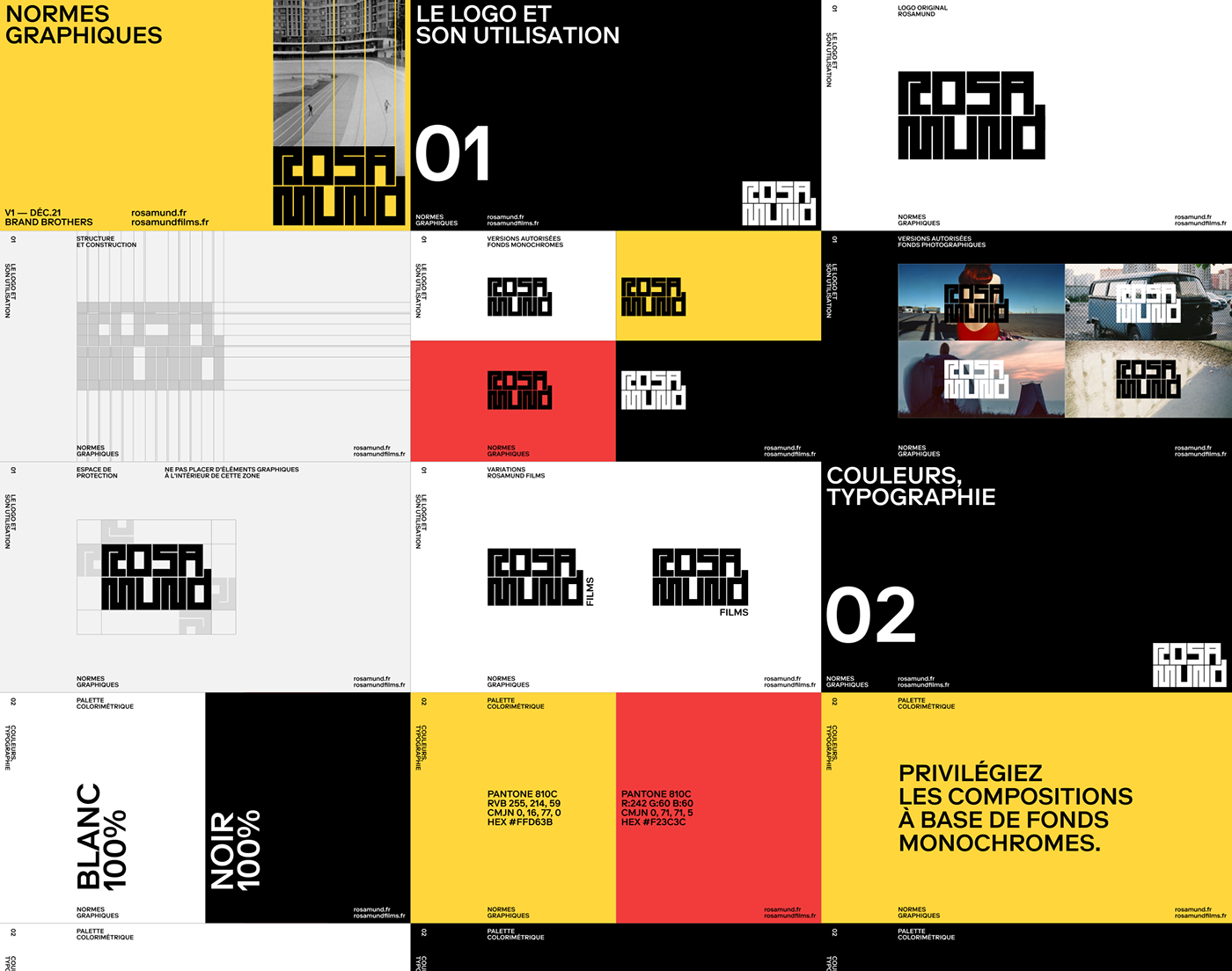
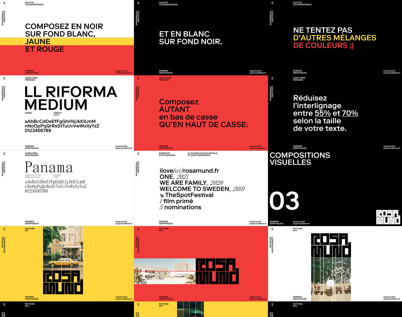
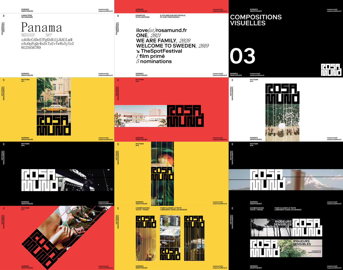
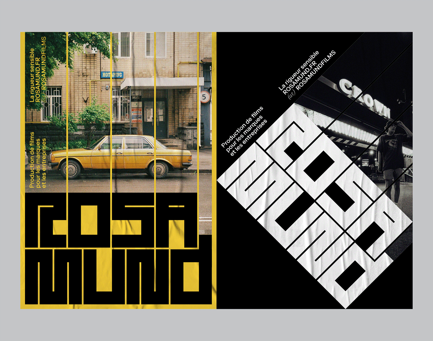
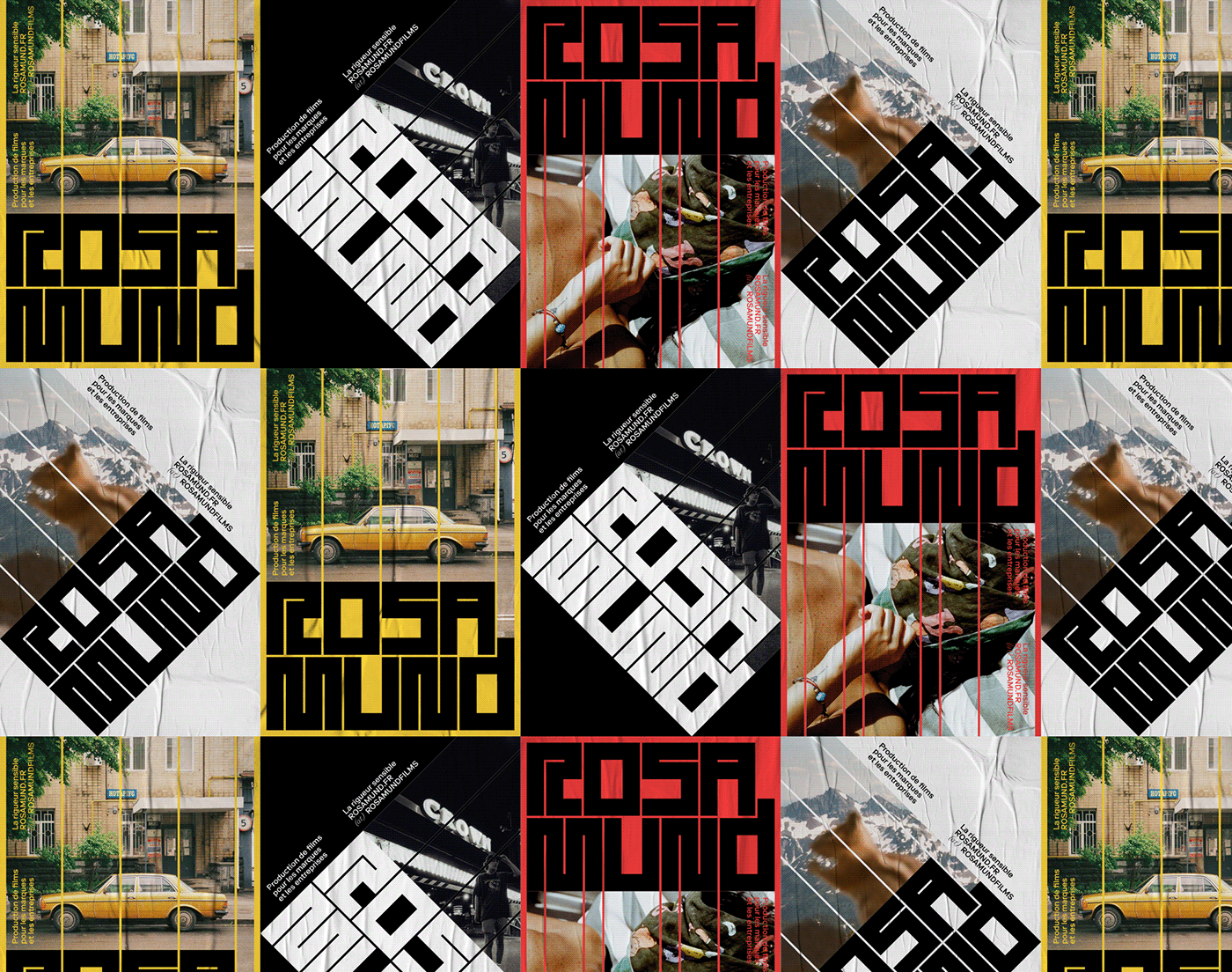
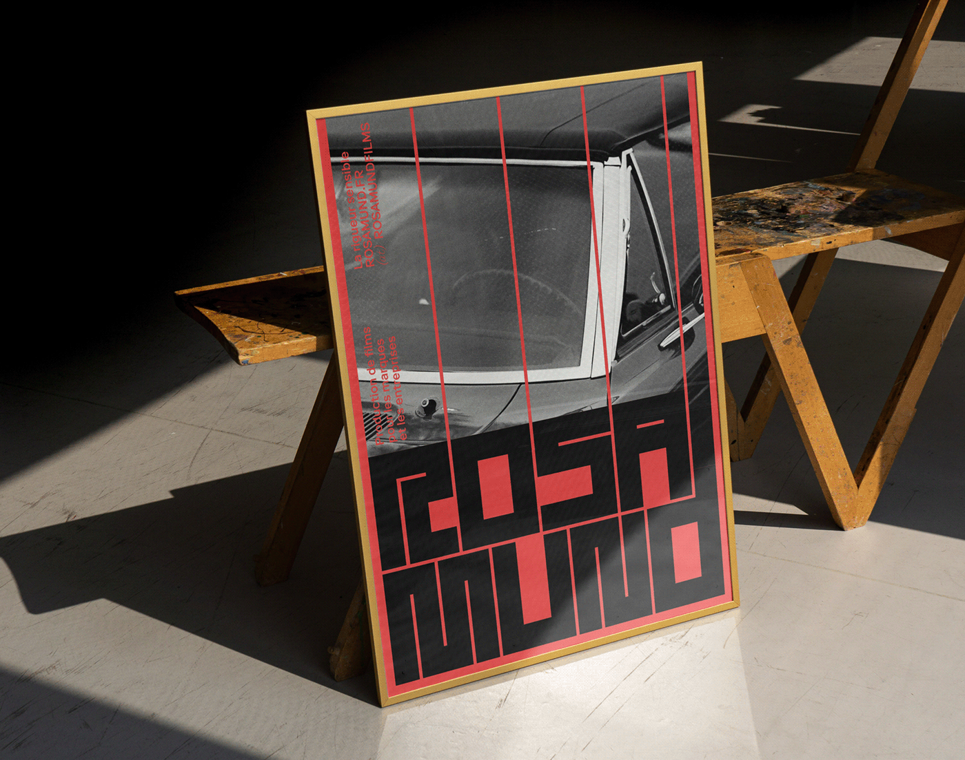
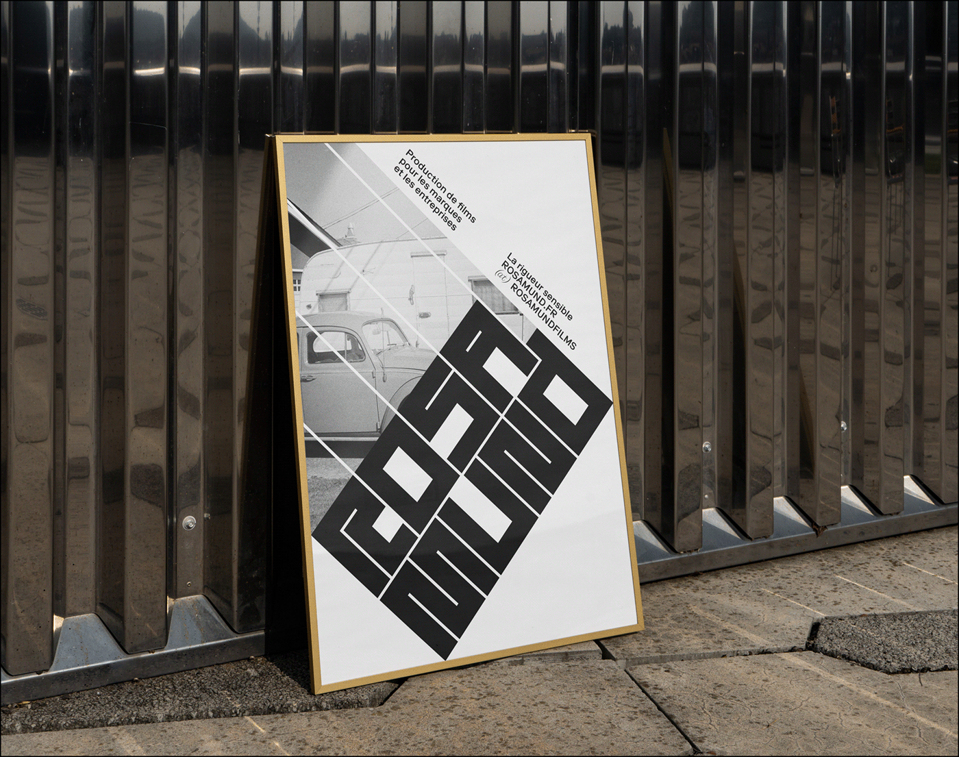
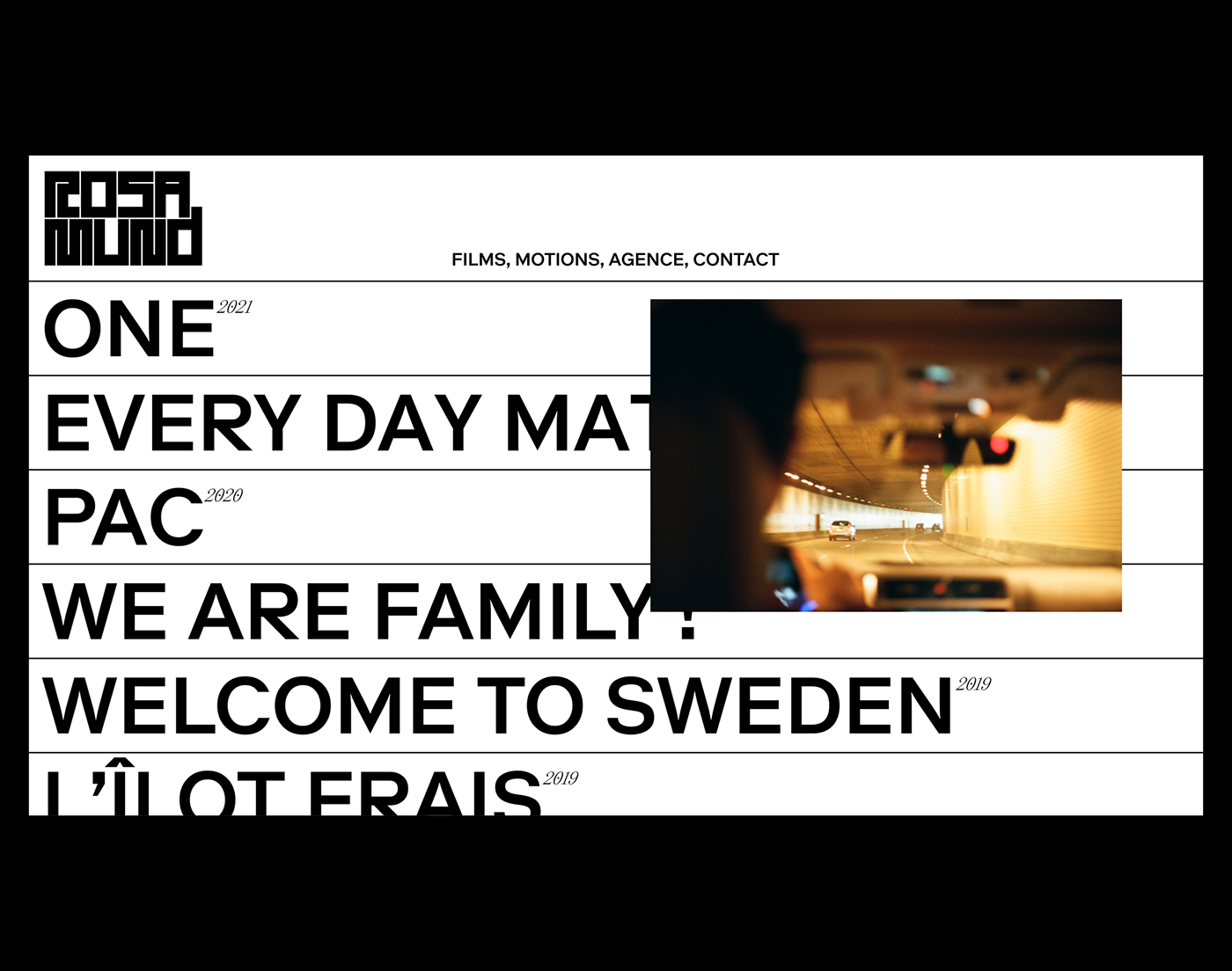
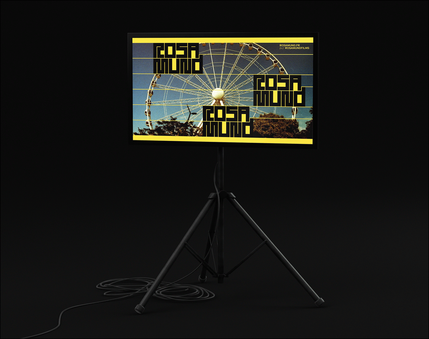
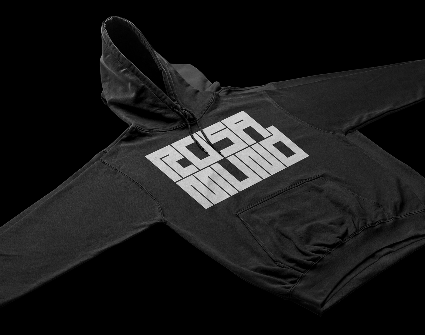
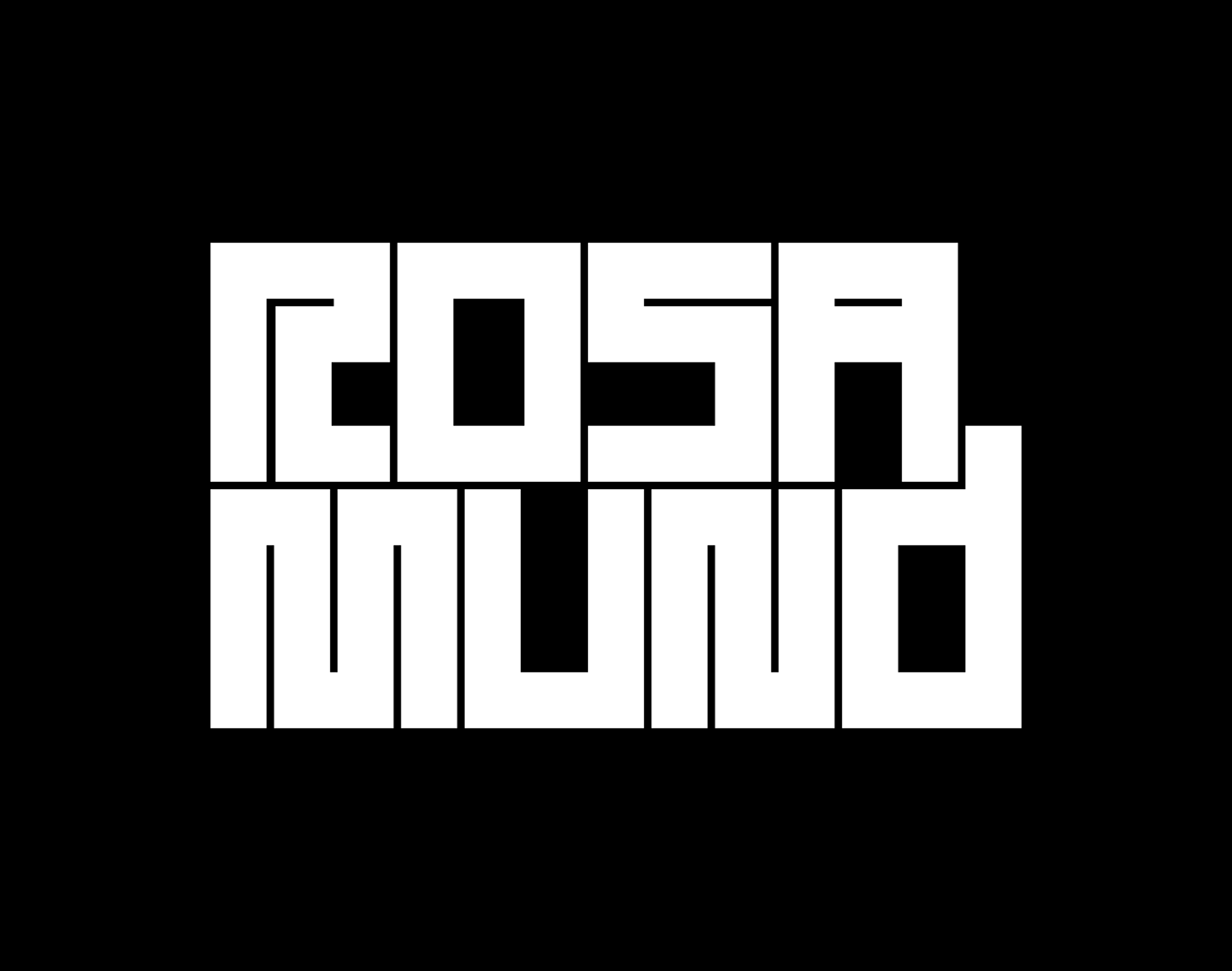
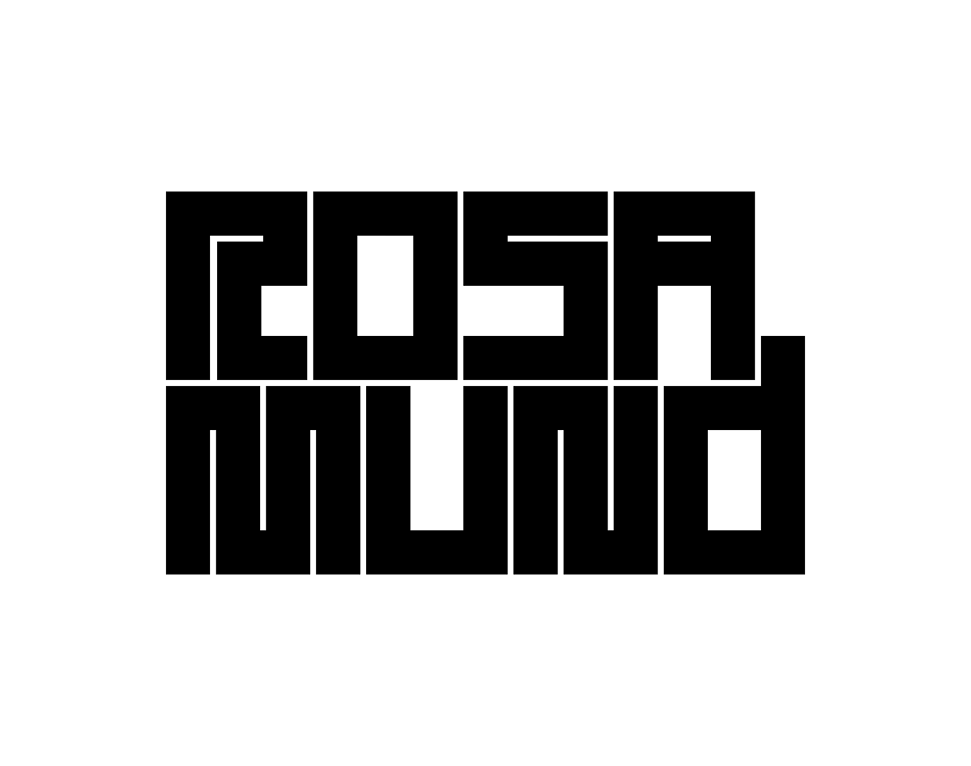
Defining its image work as rigorous and sensitive at the same time, Rosamund puts forward true stories, shot like documentaries, boosted by a recognized technical and creative requirement. This balance is translated into the identity by a thick and structured typogram, giving off notions of power and accuracy; the typographic mark dialogues directly with the image through a system of modular windows, which allows the strength and variety of the content produced by the agency to be expressed. This compositional process offers the teams the possibility of permanent renewal in the presentation of Rosamund's work, in both physical and digital formats. The entire visual territory, at once minimal and intense, is flanked by the typeface LL Riforma (Norm, Zurich), published by Lineto.
Defining its image work as rigorous and sensitive at the same time, Rosamund puts forward true stories, shot like documentaries, boosted by a recognized technical and creative requirement. This balance is translated into the identity by a thick and structured typogram, giving off notions of power and accuracy; the typographic mark dialogues directly with the image through a system of modular windows, which allows the strength and variety of the content produced by the agency to be expressed. This compositional process offers the teams the possibility of permanent renewal in the presentation of Rosamund's work, in both physical and digital formats. The entire visual territory, at once minimal and intense, is flanked by the typeface LL Riforma (Norm, Zurich), published by Lineto.
_
FR
Rosamund est une agence de production de contenus vidéo pour les marques et les entreprises, basée à Nantes et Paris depuis 2012. Travaillant avec de nombreux groupes français sur de nombreux formats de films d'entreprises et développant depuis peu un pôle films et fiction, l'agence a décidé d'accompagner son changement de nom - de Linkit à Rosamund - d'une refonte complète de son identité graphique avec Brand Brothers.
Définissant son travail d'image comme rigoureux et sensible à la fois, Rosamund met en avant des histoires vraies, tournées comme des documentaires, dopées par une exigence technique et créative reconnue. Cet équilibre est traduit dans l'identité par un typogramme épais et structuré, dégageant des notions de puissance et d'exactitude ; la marque typographique dialogue directement avec l'image par un système de fenêtres modulaires, qui permet d'exprimer la force et la variété du contenu produit par l'agence. Ce procédé de composition offre aux équipes des possibilités de renouvellement permanent quand à la présentation du travail de Rosamund, sur des formats physiques ou digitaux. L'ensemble du territoire visuel, à la fois dépouillé et intense, est flanqué du caractère LL Riforma (Norm, Zurich), édité par Lineto.
Définissant son travail d'image comme rigoureux et sensible à la fois, Rosamund met en avant des histoires vraies, tournées comme des documentaires, dopées par une exigence technique et créative reconnue. Cet équilibre est traduit dans l'identité par un typogramme épais et structuré, dégageant des notions de puissance et d'exactitude ; la marque typographique dialogue directement avec l'image par un système de fenêtres modulaires, qui permet d'exprimer la force et la variété du contenu produit par l'agence. Ce procédé de composition offre aux équipes des possibilités de renouvellement permanent quand à la présentation du travail de Rosamund, sur des formats physiques ou digitaux. L'ensemble du territoire visuel, à la fois dépouillé et intense, est flanqué du caractère LL Riforma (Norm, Zurich), édité par Lineto.